Wednesday, November 5, 2014

Project 4: Transparency

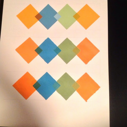
I must say, painting and applying the same transparency effect from the studies that we did was hard to do. This may be one of the hardest project that I have done for this class. For this project I drew my design on bristol paper then paint over it using acrylic paint. I applied matte medium on top of the transparency.


I really enjoyed this transparency study, however measuring diamonds on a straight line was difficult. First row of diamonds were cut out of color aid, guessing that color of the transparency effect on the small diamonds. 


"Happy Breakage Road"
We had to create an animation piece for our transparency design and it was fun to use, and a different way to look at transparency overlapping. 

Tuesday, November 4, 2014

Project 3: Simultaneous Contrast

PART ONE: 1 Color that looks like 2 ( Color Aid Paper )


    PART TWO: 2 Colors that looks like 1 ( Digital )


Monday, November 3, 2014

Project 2: Vibrating Edges

For this project I wanted to design a simple base pattern in the background that consists of diamonds and line shapes . The foreground in this design, I added the same design elements but arranged it in a more complex way. With two different patterns, and the choice of colors by lightening up the hue from the foreground, the edges tends to have a vibration.


Sunday, November 2, 2014

Project 1: Hue and Value

Choice of image for my monochromatic painting 


My monochromatic painting using yellow hues and value on Bristol paper because since the original image is yellow I thought it would be appropriate to use yellow paint.


Munsell Color Wheel


Saturday, November 1, 2014

Matte and Glossy Colors


The glossy affect gives it a rich feel and becomes more contrast then the ones above.