Wednesday, December 10, 2014
Project 6 Proposal
My strengths for this class would be understanding some of the adobe software that we have used for specific projects in this class. Also, the fact that I am on top of revising my projects and keeping in touch with my teacher Cindy. As an artist outside of class, I enjoy exploring the city and visiting different museums to gain inspiration from. Lastly, I find myself enjoying reading other artists blogs, where I also get my inspiration from, and building up my creativeness. After seeing everyone's presentation I would like to explore the color wheel more, and the study of the psychology part on each color and what their moods represents. The overall concept for my final project would be the moods on the Munsell Color Wheel, and how each color represents a mood. I want the video to look retro and simple, but humorous at the same time. This final will be created in photoshop as an animation piece, where you will see me posing different face expression for each color. The music will play throughout the entire animation and the choice of music will have an 80s beat to it. Overall, my animation piece will be a minute long.
Tuesday, December 9, 2014
Project 5: Harmony and Discord
This project I've used two color schemes that relate to "Discord and Harmony". I took a picture of a single trail track in two various ways. The whole idea of my project is suppose to be simple and interesting for the overall abstract piece.

For project five, I've chosen two of the same image in a composition
way. One picture will consist of a discord color scheme, and the next image
will be a harmony color scheme. The overall project will be an abstract piece
illustrated from Adobe Illustrator.


My Color Scheme

Wednesday, November 5, 2014
Project 4: Transparency
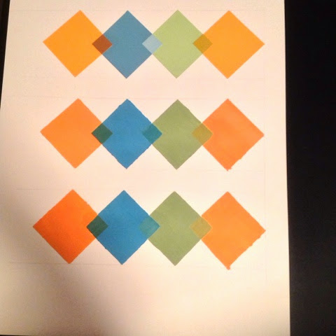
I must say, painting and applying the same transparency effect from the studies that we did was hard to do. This may be one of the hardest project that I have done for this class. For this project I drew my design on bristol paper then paint over it using acrylic paint. I applied matte medium on top of the transparency.

I really enjoyed this transparency study, however measuring diamonds on a straight line was difficult. First row of diamonds were cut out of color aid, guessing that color of the transparency effect on the small diamonds.
"Happy Breakage Road"

We had to create an animation piece for our transparency design and it was fun to use, and a different way to look at transparency overlapping.
Tuesday, November 4, 2014
Project 3: Simultaneous Contrast
PART ONE: 1 Color that looks like 2 ( Color Aid Paper )

PART TWO: 2 Colors that looks like 1 ( Digital )


Monday, November 3, 2014
Project 2: Vibrating Edges
For this project I wanted to design a simple base pattern in the background that consists of diamonds and line shapes . The foreground in this design, I added the same design elements but arranged it in a more complex way. With two different patterns, and the choice of colors by lightening up the hue from the foreground, the edges tends to have a vibration.

Sunday, November 2, 2014
Project 1: Hue and Value
Choice of image for my monochromatic painting

My monochromatic painting using yellow hues and value on Bristol paper because since the original image is yellow I thought it would be appropriate to use yellow paint.

Munsell Color Wheel

Saturday, November 1, 2014
Matte and Glossy Colors

The glossy affect gives it a rich feel and becomes more contrast then the ones above.
Friday, October 31, 2014
Transparency Effect Chart

Switching around the color swatches was difficult, but I started to get the hang of it once I started to realize how interesting the whole process was.
Friday, October 24, 2014
Color Control

I enjoy seeing the value, hue and chromo colors together in this particular way. Placing the color chips together was hard but this process shows what might work well within other colors.
Thursday, October 23, 2014
Harmonious and Balanced Color Groups

Placing each color swatch where they belong within each color groups was tricky, wasn't sure if I did this right but overall seeing the colors all together is beautiful.
Wednesday, October 22, 2014
Color Constancy

I picked each color that fit within the category that is shown on the squares. It was interesting to see the relation of both colors side by side .
Wednesday, October 1, 2014
Simultaneous Contrast Charts


This process of placing color swatches on top of these squares allows a person to see a different out look on colors, and how they react with other colors.
Thursday, September 11, 2014
Successive Contrast and Vibrating Boundaries

It is interesting to see if you place a color swatch on one of these squares it gives it a vibrating feel to the eyes.
Wednesday, September 10, 2014
Advancing and Receding Colors

"Color is perceived when our visual system responds to the stimulation of energy in the form of light"
Tuesday, September 9, 2014
Munsell Hue Chart
I treated this process as a puzzle, and it was pretty enjoyable. Looking at all these colors together are beautiful and pleasant to stare at.

My thoughts about the Munsell Book…
I really like how the design of the book is very simple and clean. The typography and images have a nice hierarchy within each page, which makes the book readable to follow.
Subscribe to:
Posts (Atom)